SPIDER-MAN! It’s no secret that our team at Insomniac Games loves the character – so we wanted to show up for the web-head’s 60th anniversary in a cool way. Cue… comics! We collaborated with Marvel to design five Beyond Amazing variant covers, featuring art inspired by the Marvel’s Spider-Man game series, our studio’s take on the character.
See our cover gallery below! Each cover is accompanied by a blurb from an Insomniac artist sharing info about their inspirations, insights, and love of Spider-Man! These issues have already begun rolling out in the U.S. with more releasing soon… check with your local U.S. retailers for availability! Marvel’s Spider-Man Remastered and Marvel’s Spider-Man: Miles Morales are available now on PlayStation 5 and PC.
John Staub
What inspired this cover?
The cover was inspired by a Spider-Man cover created by the amazing John Romita.
What tools did you use to create it?
The cover was done using Photoshop.
What’s your personal history with Spider-Man?
Spider-Man was definitely a part of my childhood growing up watching the animated cartoon in the afternoon. The opening with its 3D buildings and iconic theme song stayed with me throughout my adulthood. I always thought how amazing it would feel to be able to swing around the city. It would be many years later playing the Insomniac game that I would rediscover that feeling.
What makes a great comic book cover?
Its simplicity is what makes it great. I can imagine this cover sticking out in a comic book shop filled with hundreds if not thousands of comics all fighting for our attention with dynamic compositions. This cover would simply stand out just by contrast.
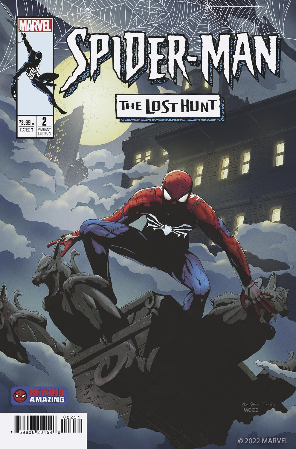
Oliver Fetscher
What inspired this cover?
This cover is a tribute to Web of Spider-Man #1 (Art by Charles Vess) issue, so that is the main inspiration. That being said, I grew up as a Spider-Man fan in the 1990’s and 2000’s and wanted to bring in some of that artistic flavor that inspired me heavily growing up. I have a big love for detailed art-work and strong compositions that tells a story in different layers.
What tools did you use to create it?
I primarily used photoshop and some 3D for setting up a base and perspective in the scene.
What’s your personal history with Spider-Man?
I was convinced I was Spider-Man as a kid and ruined a bookshelf at home after getting ideas from reading some new comics… All jokes aside, I have always been a huge comic book fan and Spider-Man has always been at the top of that list, some of my earliest drawings are of Spider-Man and his villains. I remember looking at the art, thinking that one day maybe I can draw like that.
What makes a great comic book cover?
I think that there can be many different good concepts around what makes a good cover. Sometimes I love very simplistic covers, stylized or old-school.
My favourite idea behind a cover is something that generates ideas of what could happen in the issue without telling too much. I am a big fan of mystery and seeing something that eludes or foreshadows what is to come.
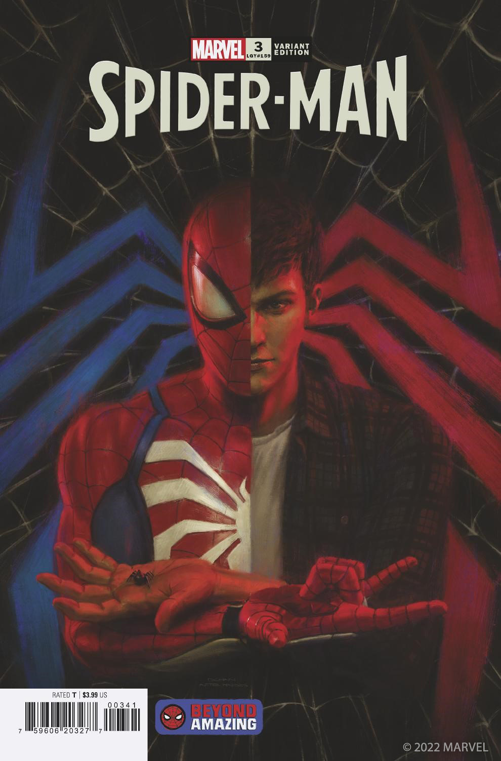
Dennis Chan
What inspired this cover or what did you pick this cover?
What really inspired me to pick this cover was how much the original art cover created by Tony Harris stood out from many of the options I was able to choose from to make this variant cover. The idea and composition were so clear, simple, and powerful but most of all the cover art captured me at an emotional level. Realizing how complex this piece was, I wanted to challenge myself to do a variant version of it and somehow keep the original feel of it.
What tools did you use to create it?
To create this illustration, I’ve used Zbrush to sculpt and pose Spider-Man suit and Peter Parker. I’ve used Blender to set up the lights and rendered using Cycles. I took this opportunity to express a more painterly look for this cover so I intentionally made a low-resolution render so I would not be lost in highly rendered details. Finally, I spent many hours overpainting the render using Adobe Photoshop to get the result that I was aiming for.
What’s your personal history with Spider-Man?
Out of two Super Heroes that I was exposed to at a very young age one of them was Spider-Man. I was not old enough to understand the text in the balloons, but the strips were so powerful to me, and I was amazed how sequential they were. I was able to understand the story without reading. Even at a young age without much life experience I felt I was able to relate to the everyday life of Peter Parker at an emotional level. The story embedded with the art kept me interested in many years up to my late teens. I pretty much had a subscription of Spider-Man comics that was dropped off into my mailbox monthly until my 20s.
What makes a great comic book cover?
For me personally, what makes a book cover great is the emotion it reflects. If the cover art can capture the audience at an emotional level, I would consider it successful.
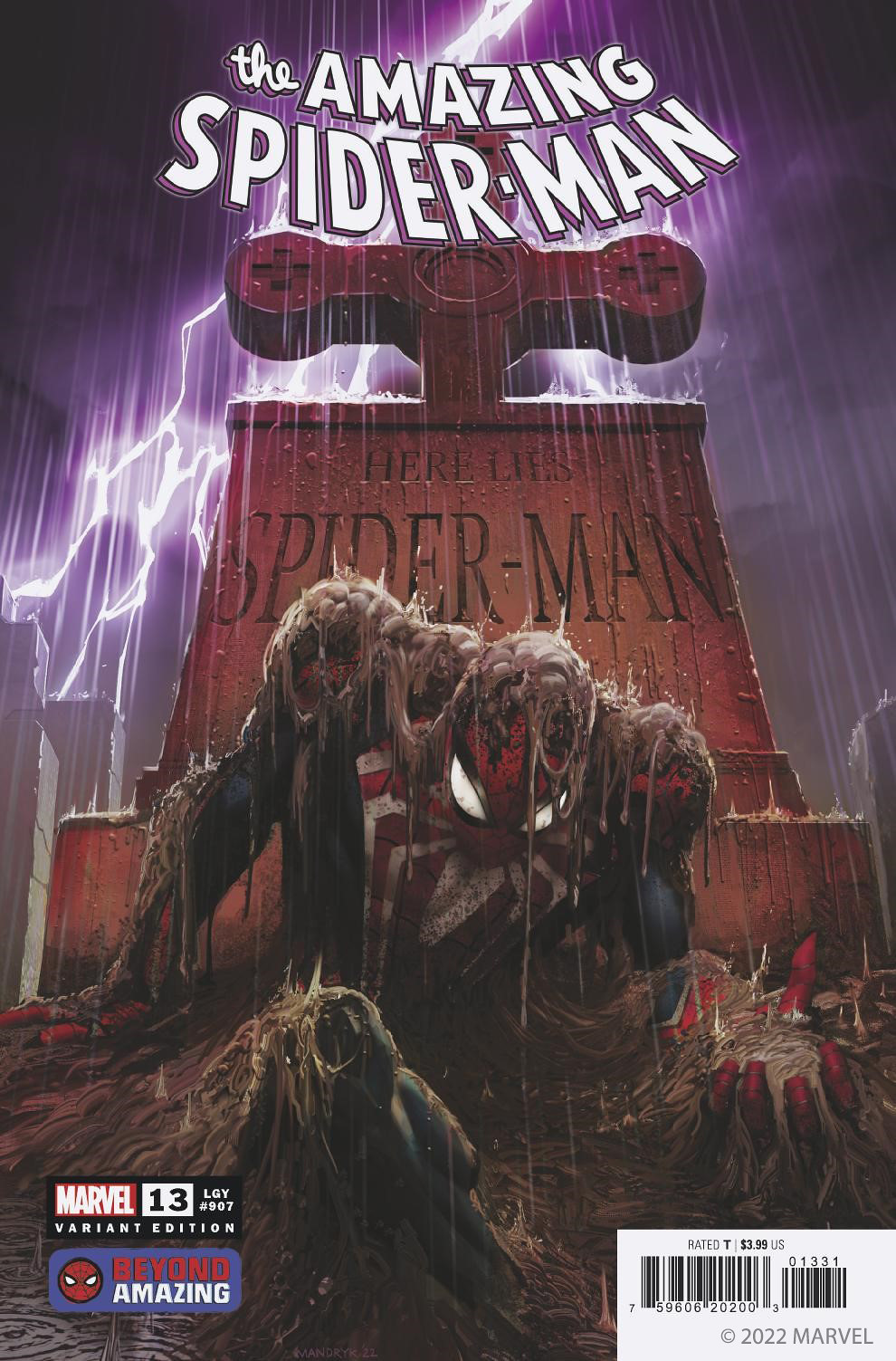
Daryl Mandryk
What inspired this cover?
This cover was a remake of the classic cover ‘Here Lies’, but with the twist of featuring the Advanced Suit.
What tools did you use to create it?
Primarily this was done all in Photoshop, using basic digital painting tools. The gravestone was modelled in Blender and composited into the image.
What’s your personal history with Spider-Man?
Spider-Man is one of my favorite Super Heroes. When I was a kid, I watched the classic cartoon and bought a lot of Spidey comics. I loved his wise-cracking personality, and the wide range of imaginative villains he faced. When I got older, I could relate to Peter’s struggles with relationships and finances =)
What makes a great comic book cover?
A few things. It has to make a good first impression, so the reader will be motivated to pick it up and read it. Therefore, the image should be arresting and dramatic, tempting you with all the excitement inside, and it needs to be clear and simple enough to communicate this quickly. It must stand out from what’s next to it on the shelf, so something about it has to be unique – this could be the colors, composition, or storytelling. I guess you could say finding a ‘hook’ for the image. It’s not an exact science, but I think if you keep these things in mind, you are at least on the path to success.
Bobby Hernandez
What inspired this cover?
This cover is in homage to the Amazing Spider-Man issue 100 cover, created by the legendary John Romita Sr. It’s inspired by the designs we created at Insomniac Games for our Marvel’s Spider-Man and Marvel’s Spider-Man: Miles Morales games.
What tools did you use to create it?
Spider-Man was posed out in 3D to get his anatomy down and help me understand the posing. This also helped me understand where the suit folded and what details would be visible.
I then used this to draw him in Photoshop along with the rest of the layout. I finished it up in Photoshop by painting and rendering Spider-Man and then drawing the additional characters with white linework on a black background to mimic the approach from the original cover.
What’s your personal history with Spider-Man?
Spider-Man has been a part of my life ever since I was a kid from playing with action figures. Collecting and reading the Spider-Man comics has had a huge impact on my art career, seeing the various artists interpret the villains as well as Spidey himself, and telling those iconic stories through comic book panels and covers. Today, I am very grateful to be currently working at Insomniac Games and being able to help add to the story and legacy of Spider-Man through the games we create.
What makes a great comic book cover?
To me, a great comic book cover is like a great movie poster: It should pull you and your interest in. It should show elements of the story without giving the story away. It suggests the tone and emotion of the story within the pages you are about to read.
You mix that with awesome composition and design, and I feel like that truly lends itself to a great cover.
Source: Playstation Blog
—


