These days, our smartphones are so much more than phones. They’re also our go-to cameras, entertainment hubs, portable computers, and so much more. However, adding new layers of functionality to smartphones has caused their user interfaces (UIs) to become more cluttered and complex – making the devices themselves harder to use. As smartphones grow increasingly more sophisticated, users require UIs that make managing the devices nice and simple.
And now, they have one. Samsung’s One UI is the company’s most simple and streamlined UI yet, built from the ground up to help users focus on what matters most. One UI’s intuitive design fosters convenient interactions, while its clean aesthetic minimizes clutter to make viewing your screen more comfortable. Follow along as we examine the innovative interface in more detail.
Natural Interactions
One UI’s streamlined structure reflects a deep understanding of how smartphone users interact with their devices today.

The interface makes navigating big-screen phones simple by effectively splitting the display in half. With One UI, the top half of the screen is for viewing content, while the lower half is for interacting with your device.
Freeing up space at the top of the screen creates a more balanced, visually comfortable aesthetic, while focusing interactions on the lower half enhances usability. Key tabs, action buttons and pop-ups are easy to reach so you can access them – and finish your task – faster.
Focus on the Task at Hand
One UI’s minimalist design eliminates unnecessary distractions to make it easier to focus on one thing at a time.

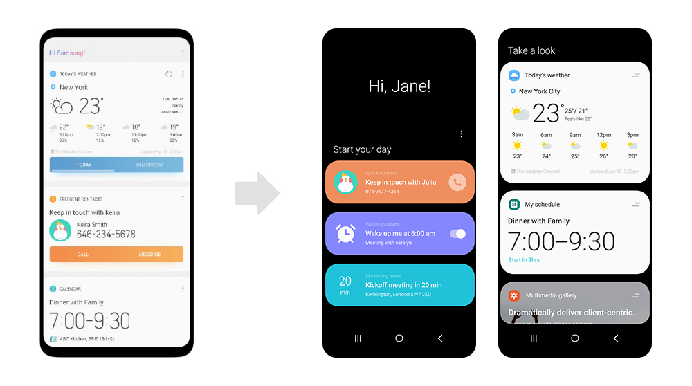
One UI’s ‘focus blocks’ help users focus on important information by presenting content in a manner that’s visually comfortable. The images on the right demonstrate how focus blocks streamline the Bixby Home screen.
The interface pares down the amount of information on display in order to offer users a more focused and fluid experience. It does this with subtle design enhancements like ‘focus blocks’, which direct your eyes to the content that matters without overwhelming you with information.
With One UI’s streamlined approach to app management, when a user launches an app, instead of filling the screen with functions that may not be useful at that particular moment, One UI keeps things simple, displaying only the functions and info the user needs to complete their task. This means that, for example, once a user enters a phone number into the dial pad, menu options unrelated to entering a phone number vanish, and new options to create a contact or start a video call appear.
A Comfortable View
Because we spend so much time on our phones, it’s important that their screens are easy on the eyes.

Visual comfort is especially important when it’s dark, which is why Samsung built a customizable Night Mode into One UI. Easily accessible and incorporated across the entire interface, Night Mode, once enabled, adjusts the screen’s tone, brightness and contrast to offer users a more focused and comfortable viewing experience.

The interface’s spacious, orderly design changes how users view their device. Clear and intuitive visuals maximize readability, fostering an overall look that’s immersive and more comfortable to take in.
One Beautiful UI
Samsung carefully refined One UI’s design with a focus on beauty and consistency.
The rounded corners of the interface’s app icons and focus blocks are perfect examples of this attention to detail. Standardizing these design elements not only enhances the UI’s aesthetic appeal, it also creates pleasing consistency with the rounded corners of Galaxy devices.

And that’s just the tip of the iceberg. Check back soon for more details on One UI’s user-centric approach to smartphone management, as well as updates on the interface’s wide release.
Source: Samsung Mobile Blog
—