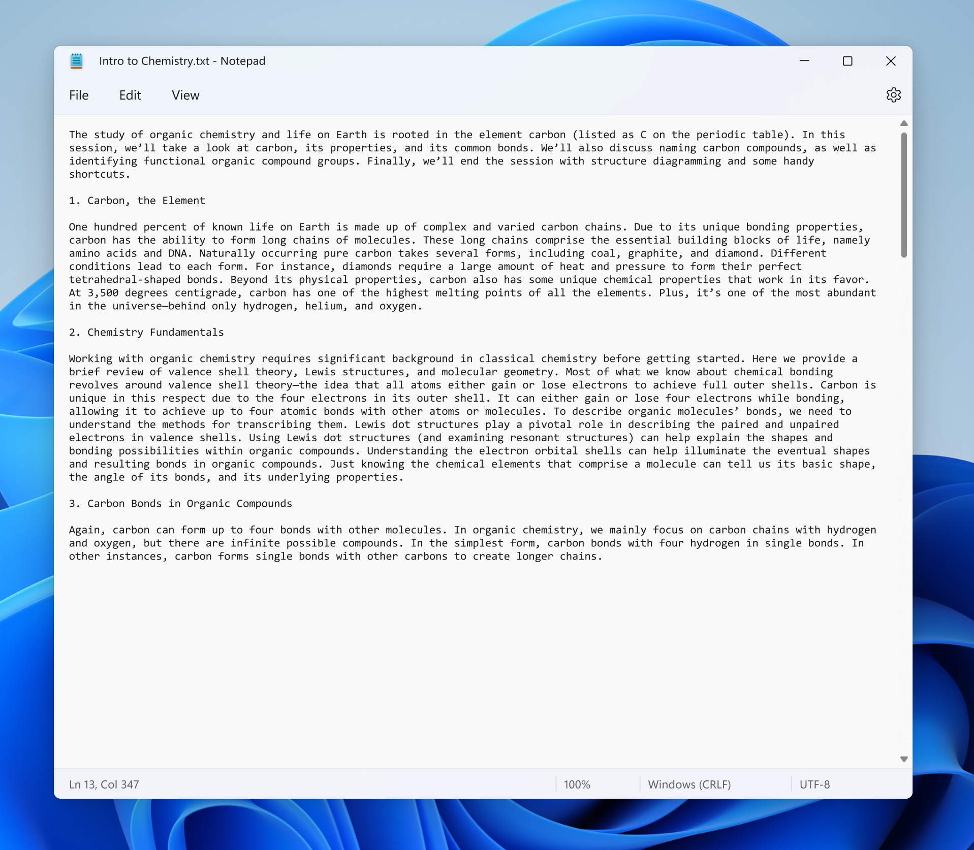
Hello Windows Insiders, today we are beginning to roll out the redesigned Notepad for Windows 11 to all Windows Insiders in the Dev Channel.
We are very excited to introduce to all of you the redesigned Notepad for Windows 11, which includes a number of changes we think the community will enjoy! First, you will notice a completely updated UI that aligns with the new visual design of Windows 11, including rounded corners, Mica, and more. We know how important Notepad is to so many of your daily workflows, so we designed this modern spin on the classic app to feel fresh, but familiar.

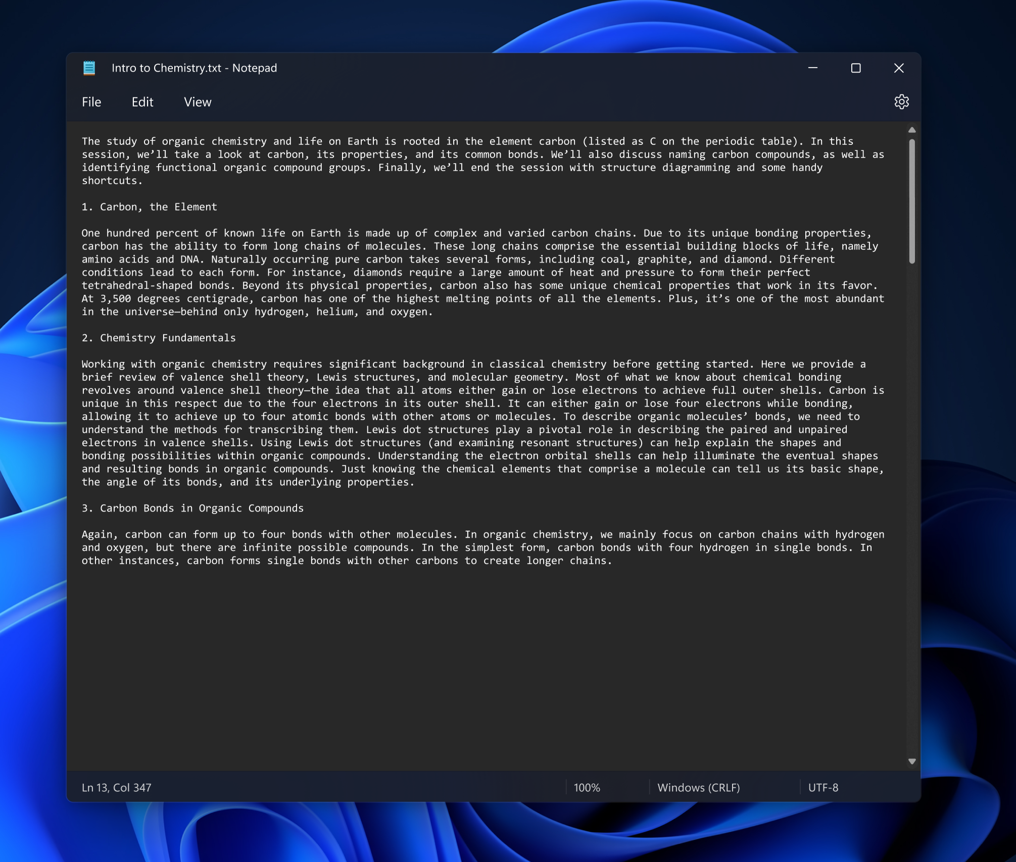
Our favorite new feature is dark mode. This has been a top community ask, and we hope you love this gorgeous new theme as much as we do. By default, Notepad will adapt to your system theme preferences, but you can change this option yourself in the brand-new settings page which is the new home for font options as well.

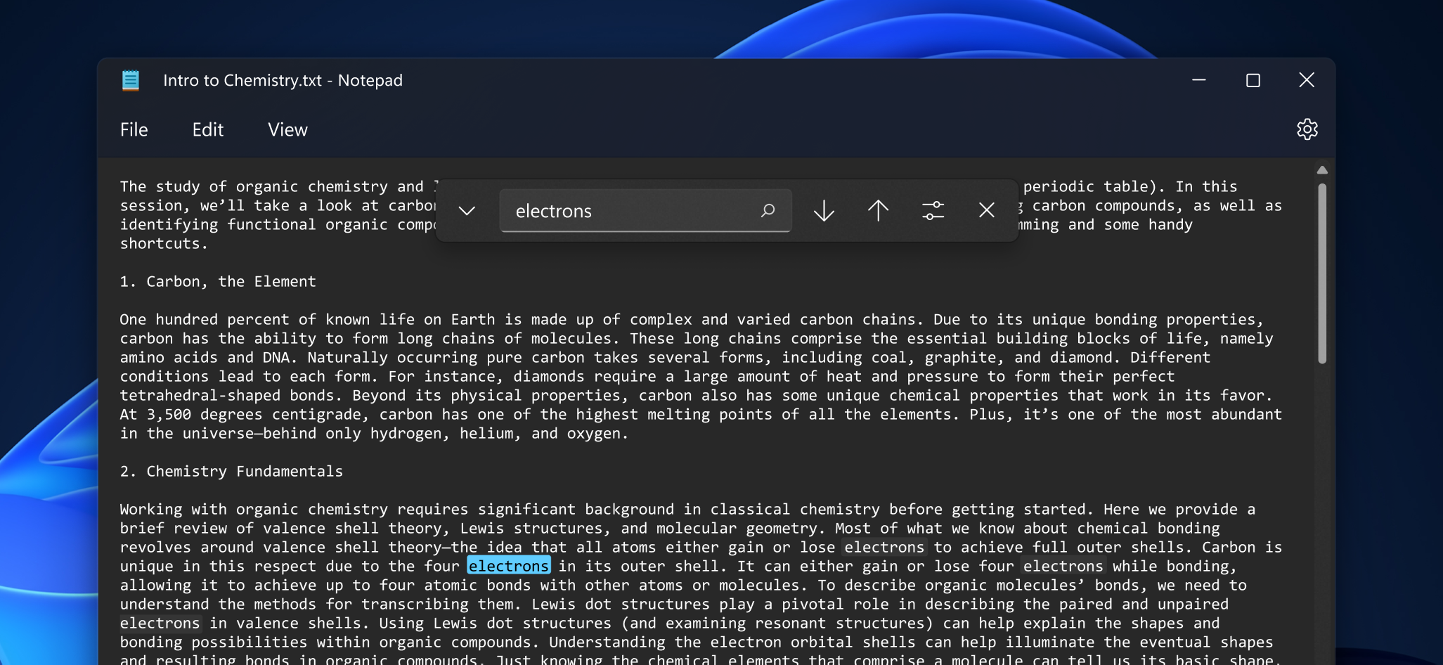
To help you be more productive, we are introducing a redesigned find and replace experience and are also adding support for multi-level undo – another top community feature request.

Productivity, performance, and reliability are paramount in Notepad. Regardless of how you incorporate Notepad into your workflows, we will ensure that Notepad continues to excel in those areas. In the preview version we are releasing today, there are a number of known issues that we will be addressing in future updates. This includes issues affecting keyboard access keys usage for when switching between different input languages or while using Japanese IME, and under certain circumstances, you may notice unexpected behavior when using shift-click to select text or when scrolling. We are also continuing to improve performance for when opening very large files.
We would love to get your feedback about the redesigned Notepad experience, so please share your suggestions in Feedback Hub (under Apps > Notepad).
Thanks,
Dave Grochocki, Principal Program Manager Lead – Windows Inbox Apps
Source: Windows Blog
—
