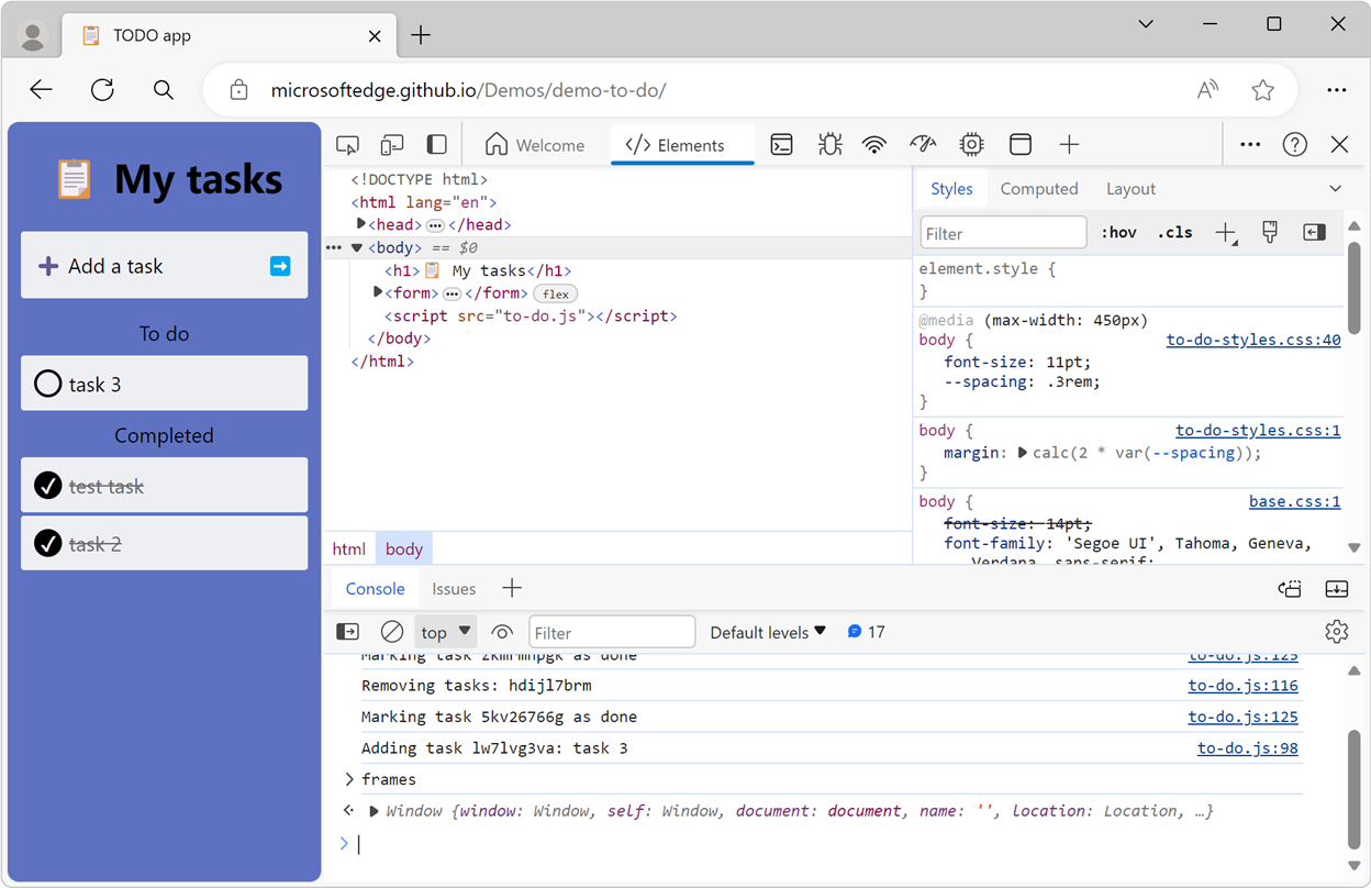
Microsoft Edge DevTools has a brand-new look! Let’s go over what it is, why we made it, and the main improvements that the redesigned UI brings.
We first started working on a redesign of DevTools almost two years ago. At the time, our starting point was the realization that, over the years, DevTools had started to become visually and conceptually overwhelming. We wanted to reduce the learning curve and complexity of the tools. So, we set out to address our users’ diverse needs by:
- Creating a redesigned Welcome tool that would be more helpful to those who want to learn or stay up to date.
- Adding ways to customize the UI and more easily make it your own.
- Introducing a new Activity Bar that would make it easier to recognize and discover the available tools.
Throughout this project we’ve applied an experimentation mindset that’s deeply rooted in user feedback. We prototyped, gathered feedback, shipped some parts, and removed others, all in an iterative plan to ensure we were building the best possible experience for all.
In fact, pieces of this major redesign are already part of DevTools, for example:
- The new Welcome tool.
- The ability to more easily open tools with the More tools button.
- The ability to move tools around between the top and bottom toolbars.
With Microsoft Edge 120, the last piece of the redesign — the Activity Bar — is now generally available to all users.
If you’re seeing the redesigned DevTools UI for the first time, continue reading to learn more about the major differences with the previous user interface.
The Activity Bar
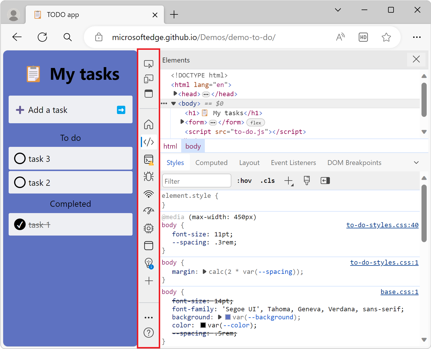
The all-new Activity Bar, and its icons, are probably the first difference you’ll notice when opening DevTools:
There are many things to unpack here. First, each tool is now represented by an icon. Tool names still appear when there’s enough space to fit them, and on hover.
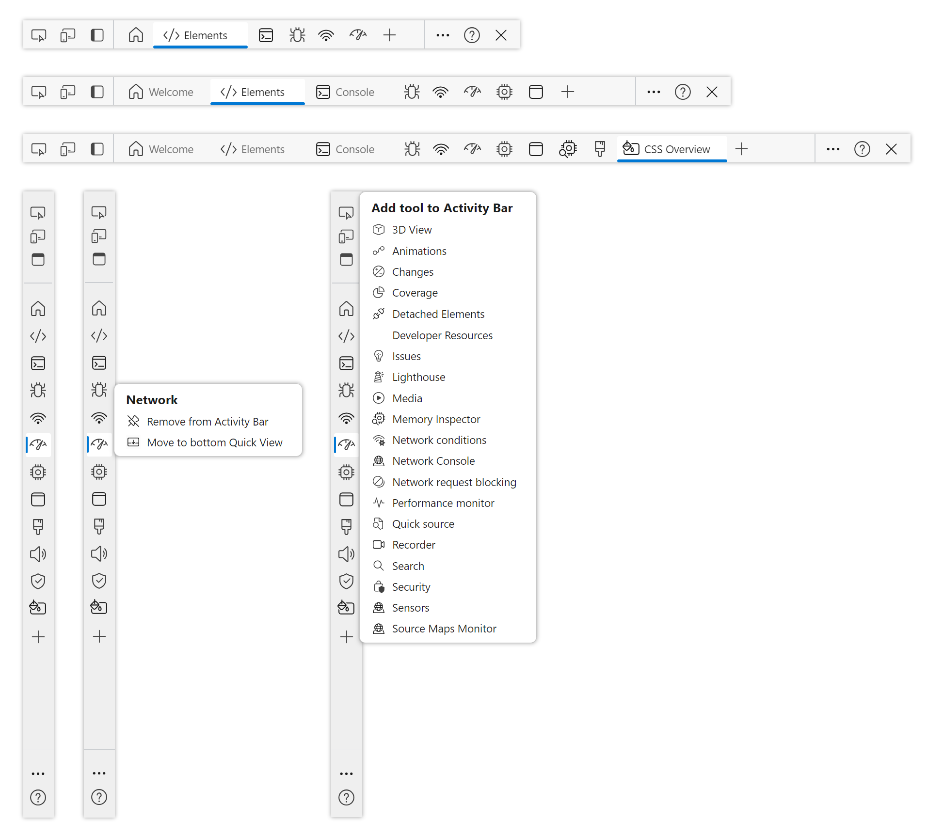
The right-hand side of the Activity Bar is also a lot less noisy than before. Previously, DevTools would sometimes display up to 7 icons on the right-hand side. The error, warning, and issue icons now appear on the corresponding tool icon, and we’ve reorganized the customize, feedback, and settings icons into only two menu items. Here is a before/after comparison:
One of the biggest changes we’ve made is to add the ability for the Activity Bar to be vertical. Just click the Customize and control DevTools (…) button, and change the Activity Bar location to left:
Depending on the screen resolution you use, the vertical orientation of the Activity Bar might suit your needs better. As a bonus, if you’re a Visual Studio Code user, the vertical Activity Bar will feel very familiar.
The Quick View toolbar
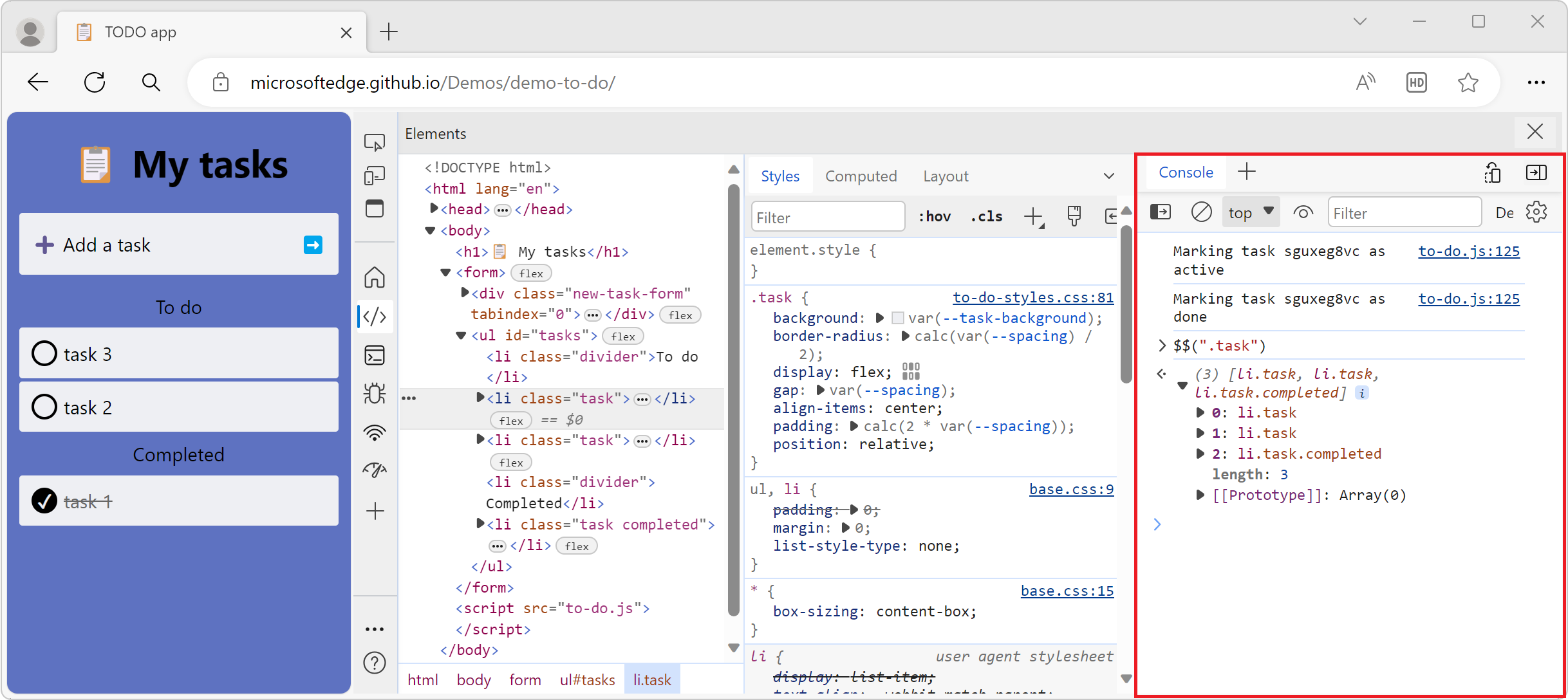
It’s always been possible to open a second tool alongside the one already open by using the drawer in DevTools. In the redesigned DevTools UI, we’re keeping the drawer but we’re renaming it Quick View, and we’re adding the ability for Quick View to also be vertical.
With Quick View, you can use both the Elements tool and the Console tool at the same time for example. And now, if you have more horizontal space available, you can make Quick View appear vertically, to the right of the current tool. Just click the Dock Quick View to the right button in the toolbar:
Opening, closing, and moving tools
Finally, with the redesigned DevTools, it’s now easier to open, close, and move tools around.
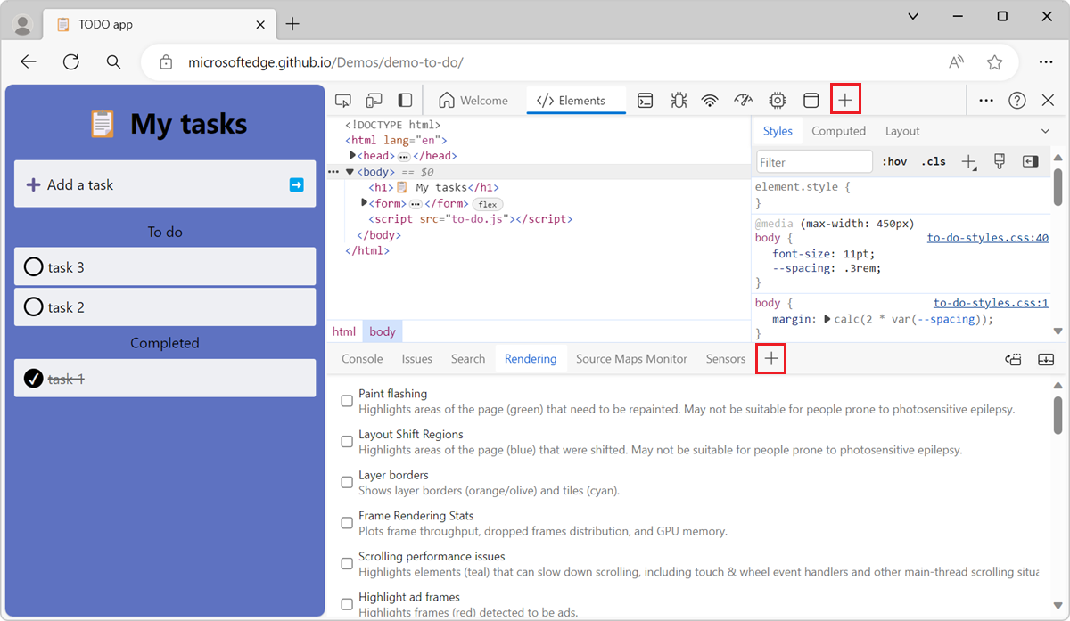
There used to be multiple different places in the UI to find tools. The new, unified, More tools button makes this much easier. You can now open any tool you want, either from the Activity Bar, or the Quick View toolbar by using the More tools button:
If you don’t need a tool anymore and want to reclaim some space in the UI, just right-click the tool’s tab to reveal a contextual menu that lets you remove the tool, or move it to either the Quick View or the Activity Bar.
To learn more, read our documentation, which we’ve completely updated to describe the new user interface as well as each individual tool.
As always, feel free to share any feedback you might have about DevTools with our team on our DevTools GitHub repository.
Source: Windows Blog
—
