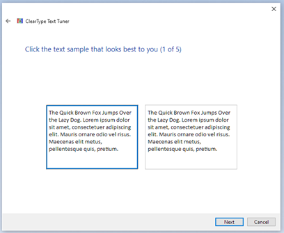
Today we are excited to announce improved font rendering in the latest Canary builds of Microsoft Edge on Windows. We have improved the contrast enhancement and gamma correction to match the quality and clarity of other native Windows applications. Font rendering will also now respect user ClearType Tuner settings when applying text contrast enhancement and gamma correction.
What’s New?
In the latest Canary builds, we now have support for applying the system settings for contrast enhancement and gamma correction of text. You can enable this with the edge://flags#edge-enhance-text-contrast flag.

To experiment with different values, run the ClearType Text Tuner (search for “Adjust ClearType text” in the Start menu). Note that Edge must be restarted whenever the settings are changed, and that only the settings for your primary monitor are used.

You can see the effect of the various choices you made in the tuner by viewing a demo page hosted on GitHub. Here is a comparison of the Edge default settings compared to the maximum settings:


Behind the scenes, the registry key KEY_CURRENT_USERSOFTWAREMicrosoftAvalon.GraphicsDISPLAY1 is modified to a value between 50 and 400.
Technical Background
To give some context as to why this change was made, we need to look at how the Legacy Microsoft Edge rendered text. Like many native Windows applications, Legacy Microsoft Edge utilized the DirectWrite framework to render glyphs to the screen. The benefit of using DirectWrite is that certain system-wide user settings are respected and use the same rendering pipeline across all other native Windows applications.
Chromium, by contrast, only utilizes DirectWrite for part of the text-rendering pipeline: font enumeration, glyph information retrieval, and glyph bitmap generation; it handles its own text shaping, layout, and rendering. This enables code reuse across platforms, but on Windows, the results are typically different than the rest of the system’s text rendering.
The final compositing of glyph bitmaps in Chromium is handled by the Skia graphics library and does not respect the Windows system settings for contrast enhancement and gamma correction of anti-aliased text. Consequently, font rendering with the hardcoded settings in Skia results in text that is subtly lighter than Windows’ system defaults. The difference is even more pronounced on CJK characters, where anti-aliased pixels comprise a larger percentage of each rendered glyph.
Looking Ahead
Today, the changes described above must be manually enabled, but after a rollout period we plan to have this behavior enabled by default in the Edge 92 stable channel. Also, while these changes are specific to Edge, we hope to be able to contribute them back to Chromium so that all Chromium-based browsers on Windows enjoy a consistent font rendering experience.
We would love to hear your feedback on whether these changes improve your reading experience and if it addresses your feedback around font clarity and contrast. If you have comments or suggestions, please reach out on Twitter @MSEdgeDev or send feedback via the Microsoft Edge Feedback Tool. As always, we will continue to listen to your feedback and look for ways to improve text rendering going forward. We think that this change will address some of the feedback around font clarity and contrast, and we will continue to look for ways to improve text rendering going forward.
– Ben Mathwig, Program Manager, Microsoft Edge
Source: Windows Blog
—